Seeing Underfitting, Good Fit, and Overfitting Live#
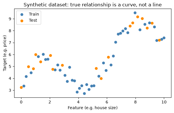
We’ll fit three polynomial regression models of increasing complexity: degree 1 (a straight line), degree 4 (a smooth curve), and degree 15 (a wiggly curve that chases every point), on the same data, and compare train vs. test error for each.
import numpy as np
import matplotlib.pyplot as plt
from sklearn.model_selection import train_test_split
from sklearn.linear_model import LinearRegression
from sklearn.preprocessing import PolynomialFeatures
from sklearn.pipeline import make_pipeline
from sklearn.metrics import mean_squared_error

np.random.seed(42)

# Ground truth: a curved relationship, e.g. price vs. size, plus noise
n_samples = 60
X = np.linspace(0, 10, n_samples).reshape(-1, 1)
y_true = 3 + 2 * np.sin(X.ravel()) + 0.5 * X.ravel()
y = y_true + np.random.normal(0, 0.5, n_samples)

X_train, X_test, y_train, y_test = train_test_split(X, y, test_size=0.3, random_state=42)

plt.figure(figsize=(7, 4))
plt.scatter(X_train, y_train, label="Train", color="steelblue")
plt.scatter(X_test, y_test, label="Test", color="darkorange")
plt.title("Synthetic dataset: true relationship is a curve, not a line")
plt.xlabel("Feature (e.g. house size)")
plt.ylabel("Target (e.g. price)")
plt.legend()
plt.show()
import numpy as np
import matplotlib.pyplot as plt
from sklearn.pipeline import make_pipeline
from sklearn.preprocessing import PolynomialFeatures
from sklearn.linear_model import LinearRegression
from sklearn.metrics import mean_squared_error

degrees = {
    1: "Underfitting (Degree 1)",
    4: "Good Fit (Degree 4)",
    15: "Overfitting (Degree 15)"
}

fig, axes = plt.subplots(1, 3, figsize=(16, 4))
X_plot = np.linspace(0, 10, 300).reshape(-1, 1)

for ax, (degree, title) in zip(axes, degrees.items()):

    model = make_pipeline(
        PolynomialFeatures(degree, include_bias=False),
        LinearRegression()
    )

    model.fit(X_train, y_train)

    train_mse = mean_squared_error(y_train, model.predict(X_train))
    test_mse = mean_squared_error(y_test, model.predict(X_test))

    ax.scatter(X_train, y_train, s=25, label="Train")
    ax.scatter(X_test, y_test, s=25, label="Test")
    ax.plot(X_plot, model.predict(X_plot), color="black", linewidth=2, label="Model")

    ax.set_title(f"{title}\nTrain MSE: {train_mse:.2f} | Test MSE: {test_mse:.2f}")
    ax.set_xlabel("Feature Value")
    ax.set_ylabel("Target Value")
    ax.set_xlim(0, 10)
    ax.set_ylim(y.min()-2, y.max()+2)
    ax.legend(fontsize=8)

plt.tight_layout()
plt.show()
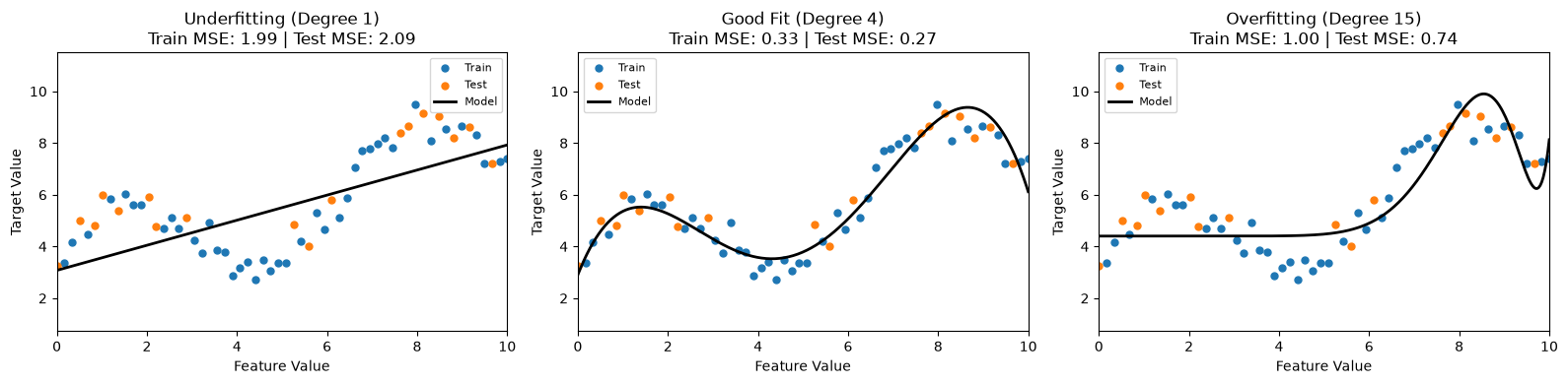
Look at the printed MSE values above:
Degree 1: Both the training and testing MSE are relatively high and similar. The model is too simple to capture the curved pattern. This is underfitting.
Degree 4: Both the training and testing MSE are low and close together. The model captures the underlying trend and generalizes well. This is a good fit.
Degree 15: The training MSE becomes very low, but the testing MSE increases. The model starts fitting noise in the training data instead of the true pattern. This is overfitting.
Run the notebook again using a different random_state in the train-test split. Notice that the degree-15 curve changes much more than the degree-4 curve. This sensitivity to small changes in the training data is called high variance, which is a characteristic of overfitting.