Types of Probability Distributions and how it connects to Data Science#
(1A). Bernoulli distribution → one yes/no outcome#
A Bernoulli distribution models a single binary decision:
yes/no, success/failure, or 1/0.
A random variable \(X\) follows a Bernoulli distribution if:
\(P(X = 1) = p\)
\(P(X = 0) = 1 - p\)
Mean (Expected Value):
\(\mathbb{E}[X] = p\)
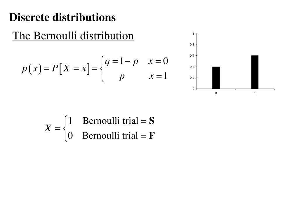 Bernoulli distribution (Slideserve) |
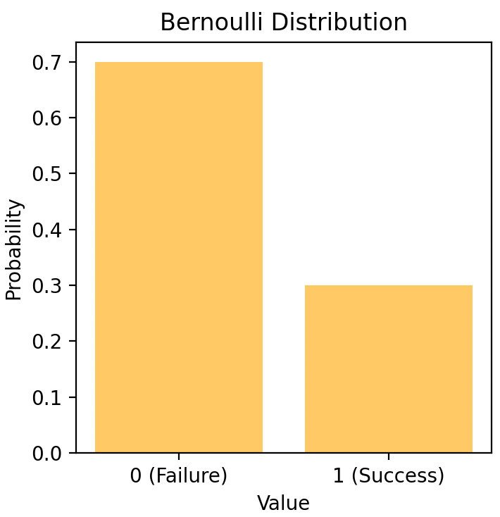 Bernoulli PMF/Outcome illustration (Medium) |
import numpy as np

np.random.seed(0)
samples = np.random.binomial(n=1, p=0.3, size=20_000)
samples.mean()
(1B) Binomial Distribution → Many Bernoulli Trials#
A Binomial distribution models the number of successes across repeated, independent Bernoulli trials.
Each trial:
has two outcomes (success / failure)
uses the same success probability \(p\)
Mathematically
If \(X \sim \text{Binomial}(n, p)\), then
\(P(X = k) = \binom{n}{k} p^k (1 - p)^{n - k}\)
Mean: \(\mathbb{E}[X] = np\)
Quick Intuition (T/F Quiz)#
A quiz has 10 True/False questions.
Each question is a Bernoulli trial.
The total number of correct answers follows:
[
X \sim \text{Binomial}(10, p)
]
In Data Sciece, it helps answer questions like how many users will click on an ad or how many tests will pass out of a fixed number of trials.
np.random.binomial(n=100, p=0.08, size=10_000).mean()
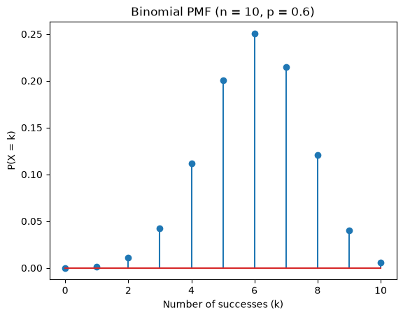
### Visual Probability Mass Function(PMF) Plot
### A PMF tells you how likely each possible value of a discrete random variable is.
import numpy as np
import matplotlib.pyplot as plt
from scipy.stats import binom

n, p = 10, 0.6
k = np.arange(0, n + 1)

pmf = binom.pmf(k, n, p)

plt.figure()
plt.stem(k, pmf)
plt.xlabel("Number of successes (k)")
plt.ylabel("P(X = k)")
plt.title("Binomial PMF (n = 10, p = 0.6)")
plt.show()
(1C) Poisson Distribution → Event Counts Over Time or Space#
A Poisson distribution models how many times an event occurs in a fixed interval
(of time, space, area, etc.).
Examples include:
number of emails received per hour
number of website requests per minute
number of errors in a system per day
Poisson = counting random events in a fixed interval at a constant rate.
Mathematically: Poisson Distribution
If \(X \sim \text{Poisson}(\lambda)\), then
\(P(X = k) = \dfrac{e^{-\lambda}\lambda^k}{k!}\)
Mean (Expected Value):
\(\mathbb{E}[X] = \lambda\)

Poisson probability mass function illustrating how the distribution depends on the average rate $\lambda$. The x-axis shows the number of events $k$, and the height of each bar represents $P(X = k)$. When $\lambda$ is small, most probability mass is concentrated near $k = 0$ or $1$. As $\lambda$ increases, the distribution shifts to the right and becomes more spread out, reflecting higher and more variable event counts. Source: Wikimedia Commons.
What Does \(\lambda\) Mean? \(\lambda\) (lambda) is the average rate of events per interval.
Example: \(\lambda = 3\) means on average 3 events per interval
In a Poisson distribution, the mean equals the variance
What Is \(e\)? \(e \approx 2.718\) is a mathematical constant (Euler’s number). It naturally appears in models involving random arrivals and decay. You do not need to compute it manually, software handles it
Key Assumptions (Very Important)#
The Poisson model assumes:
Independent events
One event does not affect anotherConstant average rate (\(\lambda\))
The rate does not change over the intervalEvents occur randomly
Not in clusters or bursts
If these assumptions fail, Poisson may not be appropriate.
It is useful for modeling arrivals, failures, errors, or requests when events happen independently at a roughly constant rate.
np.random.poisson(lam=3, size=10_000).mean()
(1D) Zero-Inflated Poisson → Excess Zeros in Count Data#
Some real-world count datasets contain many more zeros than a standard Poisson model can explain.
Examples:
many users make zero purchases
many customers file no insurance claims
many days have no system errors

A standard Poisson model assumes zeros occur naturally from random variation. When zeros appear too frequently, this assumption breaks.
Idea: Zero-Inflated Poisson (ZIP)
A Zero-Inflated Poisson model assumes two underlying processes:
(1) Inflation component (Bernoulli-like):
Determines whether an observation is a structural zero
(e.g., an inactive user with no chance of events)(2) Poisson component:
Models the number of events when activity is possible
This separation distinguishes:
“cannot happen” zeros (structural zeros)
“could happen but didn’t” zeros (random zeros)
Why This Matters? If excess zeros are ignored:
Poisson underestimates zeros
model fit degrades
conclusions become misleading
When to Use Zero-Inflated Poisson#
Use a Zero-Inflated Poisson model when count data has far more zeros than a standard Poisson can explain.
(2A). Uniform → equally likely values#
A Uniform distribution assumes all values in a range are equally likely.
Mathematically: Uniform Distribution
If \(X \sim \text{Uniform}(a, b)\), then
\(f(x) = \dfrac{1}{b-a}\) for \(a \le x \le b\)
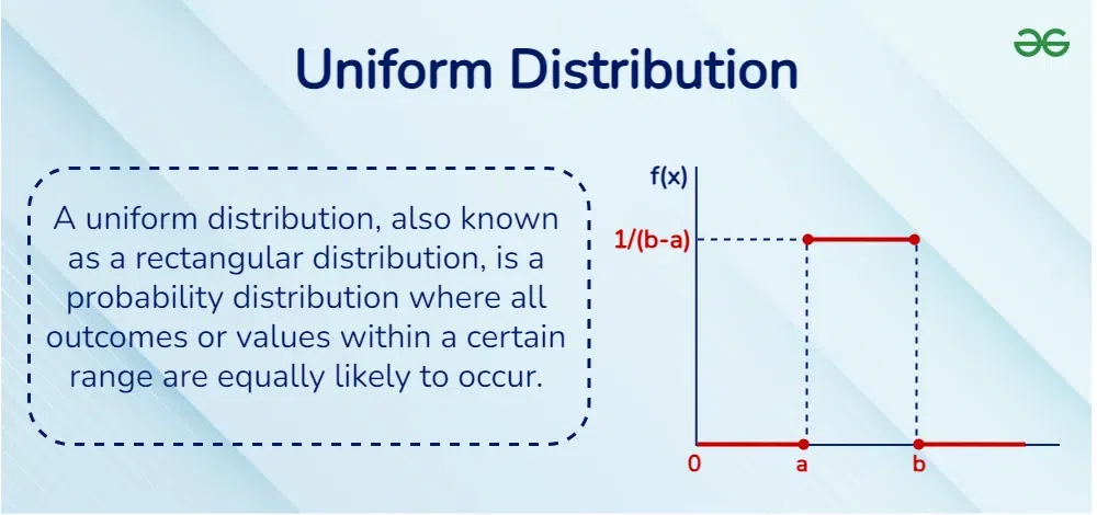
Source.Geeksforgeeks.
It is often used as a baseline model, for random sampling, simulations, and sanity checks when no additional structure is assumed.
np.random.uniform(0, 1, size=10_000).mean()
(2B) Normal (Gaussian) Distribution → Noise, Error, and Aggregated Behavior#
The Normal distribution describes data that clusters around a central value, with fewer observations as you move farther away.
It is often called the bell-shaped curve.
Mathematically
\(X \sim \mathcal{N}(\mu, \sigma^2)\)
where:
Mean (\(\mu\)): the center of the distribution — the average or typical value
Standard deviation (\(\sigma\)): how spread out the values are — larger \(\sigma\) means more variability
For a Normal distribution:
Mean = Median = Mode = \(\mu\)
(the average, middle, and most frequent value coincide)
Intuition#
The Normal distribution appears when:
many small, independent effects add together
we observe averages or measurement noise
This is why it commonly appears in:
sensor and measurement noise
model residuals (errors)
test scores and biological traits
Bell-shaped Normal distribution showing center and spread. Source: GeeksforGeeks.
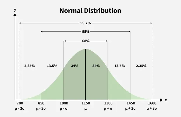
The 68–95–99.7 Rule#
The Normal distribution has a predictable spread:
~68% of values lie within ±1σ of the mean
~95% lie within ±2σ
~99.7% lie within ±3σ
This rule helps quickly estimate where most data values fall.
Why the Bell Shape Appears#
Most values are close to the mean
Extreme values are rare
Data spreads out symmetrically on both sides
Averages are common, extremes are rare, and variability matters.
np.random.normal(loc=0, scale=1, size=10_000).mean()


##Why Distribution Awareness Comes First

Understanding how data is distributed helps determine:

- which statistical tests are valid
- which machine learning models are appropriate
- which evaluation metrics are meaningful

Using the wrong distributional assumptions can lead to confident but incorrect conclusions, even when the computations are correct.

In data science, modeling starts with understanding the data-generating process, and probability distributions are the language we use to describe it.


---
> **Data Science Connection**
>
> - Bernoulli and Binomial → classification outcomes, A/B testing
> - Poisson and Zero-Inflated Poisson → event counts, sparse data
> - Uniform → random baselines and simulations
> - Normal → noise, error, averages, and model residuals
>
> In practice, **distribution awareness comes before modeling**.
---