BONUS: Python Visualization#
import numpy as np
import matplotlib.pyplot as plt
from scipy.stats import norm, t
#Interactive Tail Visualization

z = 2.0
x = np.linspace(-4,4,500)
y = norm.pdf(x)

plt.figure(figsize=(8,5))
plt.plot(x,y)

# right tail
plt.fill_between(x, y, where=(x>=z), alpha=0.4, label="Right tail")

# left tail
plt.fill_between(x, y, where=(x<=-z), alpha=0.4, label="Left tail")

plt.title("Two-Tailed Test")
plt.legend()
plt.show()


z = 2.0
x = np.linspace(-4,4,500)
y = norm.pdf(x)

plt.figure(figsize=(8,5))
plt.plot(x,y)
plt.fill_between(x, y, where=(x>=z), alpha=0.4)

plt.title("One-Tailed Test (Right)")
plt.show()
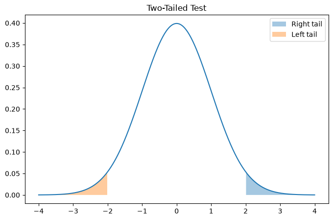
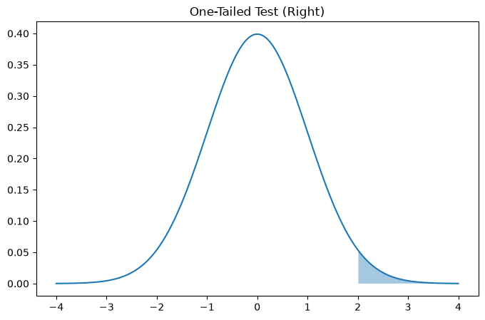
Notice:
Two-tailed → split probability across both ends
One-tailed → all probability in one direction
One-tailed tests are more powerful but must be justified BEFORE analysis.
'''
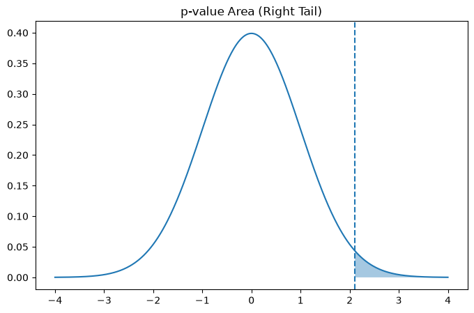
The p-value is the shaded area beyond the test statistic.
It represents how extreme the observation is.
'''
z_score = 2.1
x = np.linspace(-4,4,500)
y = norm.pdf(x)
plt.figure(figsize=(8,5))
plt.plot(x,y)
plt.fill_between(x, y, where=(x>=z_score), alpha=0.4)
plt.axvline(z_score, linestyle="--")
plt.title("p-value Area (Right Tail)")
plt.show()
## Understanding Sampling Variation
'''
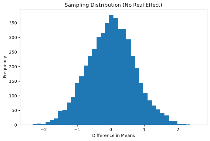
Why Do We Need Hypothesis Testing?
Even if both systems were identical, sample means would still differ.Let’s simulate that situation.
Assume: Both groups truly have the SAME average. We repeatedly sample users and measure the difference.
This shows how random variation alone can create differences.
'''
np.random.seed(0)
differences = []
for _ in range(5000):
group1 = np.random.normal(24, 5, 100)
group2 = np.random.normal(24, 5, 100)
differences.append(group2.mean() - group1.mean())
'''
Sampling Distribution of Mean Differences:
This shows the range of differences expected purely by chance.
'''
plt.figure(figsize=(8,5))
plt.hist(differences, bins=40)
plt.xlabel("Difference in Means")
plt.ylabel("Frequency")
plt.title("Sampling Distribution (No Real Effect)")
plt.show()