Bonus: Animated Sampling Distribution#
What happens if we repeatedly take samples from a population? Each sample has a different mean. When we collect many sample means, they form a distribution. This animation shows:
Draw a sample
Compute sample mean
Add it to histogram
Repeat
Watch how randomness becomes structure.
### Install Pillow (GIF support)
!pip install pillow
Requirement already satisfied: pillow in /opt/hostedtoolcache/Python/3.11.15/x64/lib/python3.11/site-packages (12.2.0)
import numpy as np
import matplotlib.pyplot as plt
from matplotlib.animation import FuncAnimation

# reproducibility
np.random.seed(42)

# population parameters
population_mean = 50
population_std = 10

# sampling parameters
sample_size = 30
num_frames = 200

sample_means = []

fig, ax = plt.subplots(figsize=(8,5))

def update(frame):
    ax.clear()

    # draw a random sample
    sample = np.random.normal(population_mean, population_std, sample_size)
    sample_mean = sample.mean()

    sample_means.append(sample_mean)

    # histogram of sample means
    ax.hist(sample_means, bins=20)

    # show true population mean
    ax.axvline(population_mean, linestyle="--")

    ax.set_title(f"Sampling Distribution (n={sample_size})")
    ax.set_xlabel("Sample Mean")
    ax.set_ylabel("Frequency")

anim = FuncAnimation(fig, update, frames=num_frames, interval=100)
anim.save("sampling_distribution.gif", writer="pillow", fps=10)
print("GIF saved!")

from IPython.display import Image
Image("sampling_distribution.gif")
GIF saved!
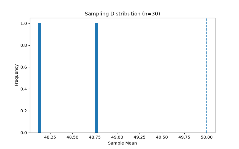
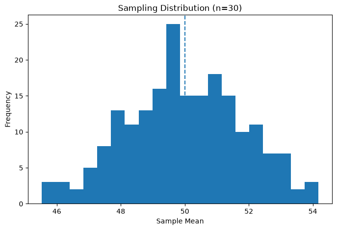
Notice:
At first → sample means are scattered
Over time → they form a bell-shaped curve
This happens even if the population is random.
This is the foundation of hypothesis testing. Remember:
Small samples → wide distribution -Large samples → narrow distribution
Task: You can compare Sample Sizes Animation
sample_size = 5 # try 5, 30, 100